Less is More

I constantly struggle with saying too much. To be honest? I often lose that struggle.

I lose because I want to explain more. I want to address every question that might come up. I want to make sure there is an understanding.

Paradoxically, though, after a point, more information complicates the topic. It becomes more confusing, not less.

Lately I’ve been deleting whole sentences. It’s OK to leave something open for people to ask about.

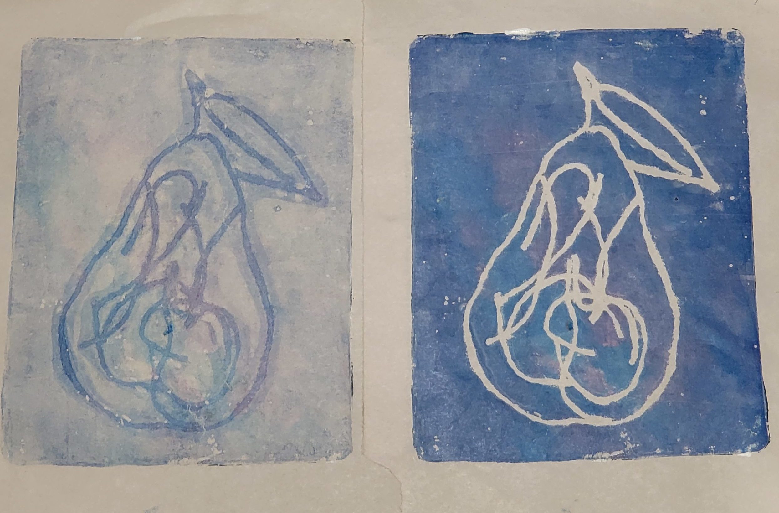
I thought of this today because of a recent art exploration, using yarn or string to mask paint, picking up the unmasked paint with paper, then removing the yarn/string and picking up the rest. The idea is to aim for what you want in the 2nd print.

I was underwhelmed with the effect in the video I watched. And then I did it. And I LOVED it. And I realized that with very few lines, a lot can be evoked in a drawing.

2 prints of pears in blue with purple tinges. The one on the left is the first print, where the outline of the pear and the internal texture is left blank with paint filling in the rest. The one on the right, the target image, has the most paint where the yarn was.

With the first set of prints, I added in some texture in the center of the pair. But I realized – I did not need to. It would be every bit a pear, with that detail removed.

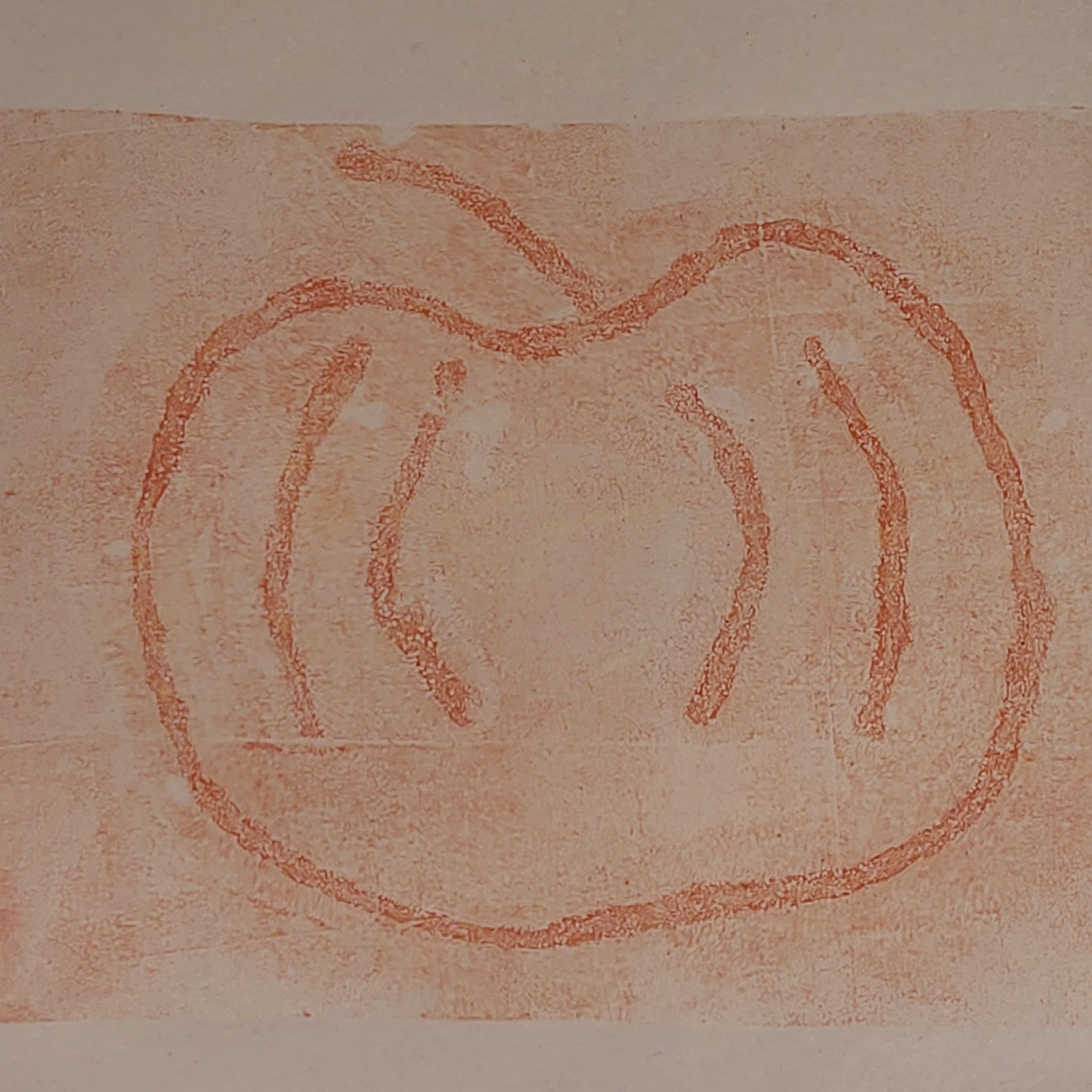
So I tried another experiment, and like the pear, I really like how this came out:

Same style as before, but this time 1 image - just the 2nd print of what the yarn left behind. The image is of a pumpkin and the lines are in orange.

A reminder that less can be more. In art, in speaking, and in correspondence.

I will (ironically) add a caveat here, which echoes Teresa Torres – drawings can say so much with just a few lines – more so than just a few words or sentences. I’m glad to have this reinforced even though I have yet to work on my own product management drawing habit.

What Does Transparency Mean?

One of the things I love about making art is that it often inspires me to make connections I had not made before. I’m currently working my way through Julie Balzer‘s A Year of Gelatin Printing class, and there’s a month called “Layer Layer Layer” that includes a lesson on transparency.

The first technique was simple, as the outcome was not meant to be the artwork. In order to assess whether or not a particular tube of paint was transparent, the lesson was to grab a book page* and apply paint to it, to see whether or not the paint is opaque, semi-transparent, or transparent.

It is not a particularly challenging lesson, which gave me time to think about when I might want different levels of transparency, what kinds of layering I might do.

a book page. The middle has no paint, the top has a layer of transparent orange, the bottom has a layer of semi-transparent red.
Transparent at the top, semi-transparent at the bottom

Suddenly my brain leapt to a realization – transparency in a business context is often stated as a binary. I’m a huge fan of smashing binaries to get the rich matrix that lies beneath, and this was no different.

Transparency can mean:

  • Decisions, and reasons for making those decisions, are talked about openly.
  • Being open and honest about bad news, a project going off track, or a timeline change, instead of covering these up.
  • Recognizing those who supported your effort, helped with research, or lent their eyes and opinions to make your work better.
  • Sharing your roadmap publicly, and sharing any changes publicly
  • Agreeing with a coworker or customer who has complaints about your product
  • Being forthcoming about product or team limitations

Of course, transparency can be taken too far. There are plenty of reasons for privacy – discussions with HR (including hiring, retention and losing employees), not telling employees about a big change (e.g. merger) until you know it’s going to happen so uncertainly doesn’t spread, and of course personal details such as government ID numbers, bank information for direct deposits, and authentication credentials.

Transparency is not simply a matter of making information available, though. Good transparency is not just a permissive shared folder or wiki; good transparency ensures that people are well-informed.

For example: let’s say the 50-page employee handbook changes. Transparency is on a spectrum, with one end being an oversimplified notification:

Please note, the employee handbook has changed for US employees.

This is the equivalent of making everything public and letting people sort out for themselves not only which information is significant, but what, if any, changes there have been to call awareness to. It’s not particularly useful for transparency – it’s opaque, like the top section of black paint on this book page:

a book page, with an opaque thick black strip at the top, the middle has no paint, and the bottom is semi-transparent through brown paint
Opaque at the top, semi-transparent at the bottom

Semi-transparency, such as the brown paint at the bottom of the page in the image above, might be to explain what has changed:

Please note, the employee handbook for US employees has been changed to reflect the following policy changes:

– “Hairstyle” and “hair texture” are now explicitly named as protected categories under discrimination, harrassment, and equal opportunity employment.

– There is a new section explaining the ban on firearms at the workplace.

Also known as, “Please don’t make me read 50 pages to figure out what changed!”

I pointed out that this might be semi-transparent, as it depends on how it’s done, and if it accurately portrays important changes and downplays unimportant changes. Of course, what is important can be different for different departments, teams and people at an organization, so this can be a bit trickly.

Similarly, full transparency is highlighting what changed – this method calls out exactly what changed, like a version history or file diff. If there are very few changes, this can illuminate what changed better than a description of the changes. However, if there are a lot of changes, a summary might be better.

What would the most useful form of transparency be? Well, it depends on the recipient as well. I would prefer a mixture of the three, if there are a lot of changes; if there are a few significant changes, highlighting would suffice; and if there are many repetitive changes, an announcement is fine – e.g. “all instances of dog have been changed to pet”.

I’m sure we all have stories of how too much transparency caused issues – not being able to find a document or conversation because all docs and conversations are public.

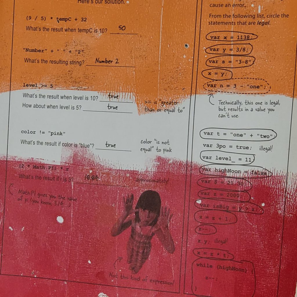
* I have an old copy of Head First HTML 5 Programming I use for painting on book pages

It’s the Little Things

More than once, I have said that one of my KPIs for my performance reviews should be “hours of meetings my manager [or coworker] no longer needs to go to.” Usually when I come onboard, I am helping ease a tough workload, and it makes me happy to be able to help.

There are many small ways I try to make the lives of my coworkers easier. Many of these items save more time for my coworker, than they take for me to do. And I believe they are good practice overall.

Send a Link

If I could wave a magic wand and have ONE of these items always happen, it would be this one: SEND A LINK.

So often, I get an email or chat message that refers to an existing document or presentation. If the message does not contain a link to the presentation…in the best case scenario, I type a key phrase into my address bar and my browser’s smart search finds it. In a slightly worse scenario, I cannot locate it easily and have to go digital spelunking.

In the worst case scenario, I have no idea which document or presentation is being referred to, and I have to either figure it out, or ask for a link.

If the message contains a link, I can click it and be there. This saves a lot of time because usually when you’re messaging about something, you are looking at it or recently have looked at it. The link is readily at hand, in your paste buffer, or in your clipboard history (if you’re on a system without a built-in clipboard history, find an app to get one, they’re super handy!).

Give Appropriate Context

Giving a link is a subset of giving appropriate context. This can be difficult to get right; however, there are some bits of context that are usually appropriate. In fact, the previous point – “Send a Link” – is about giving context!

Now, this is something I suffer from on both sides, as I am both an over-explainer and have a terrible memory, and often need a bit more context than people provide. Here’s an example:

Hi, here’s the file we talked about in the meeting we had.

I have a lot of meetings every day, and a terrible memory. I’m really good at writing down “Follow up: X promised me Y report”, and with this I might have to go to my notes if I didn’t remember. However this, only slightly longer, gives me the details I need:

Hi, here’s the report on lineage usage that we talked about in the KPI meeting we had.

Here’s another example. I was going to send our beta program lead a Slack message like this:

Hi! I’m ready to put information into the beta software now. Where do I start?

I realized that she runs lots of beta programs, so I should give her some context:

Hi! I’m ready to put information into PROGRAM for the NEW_TOOL technical lineage beta test. Where do I start?

This may seem trivial, but it can help people decide whether or not to handle your task immediately or wait until later. If I know what that report is, I know if it’s something I need to study, or can just glance at. If I’m doing a pass through my e-mail, and I can glance at the report to get what I need, I’m going to do that right away. Otherwise, if I know I need to study it, or I’m not sure, I’ll save it until after I’m done checking my email for the most important items.

In the most egregious case, I once saw a message where someone said

Look at the first three errors, you’ll find what you need.

This was from someone asking for help, and it’s quite likely they read the error messages and didn’t quite understand what was going on. And in fact, they asked for clarification. What they were looking for was something along the lines of:

It seems like a string was provided as a numerical input.

I suspect the messenger was trying to “teach how to fish”…This could have been done by saying something like

The first three errors are where the problem is – the first one points out the file that had the issue, the second points out the function, and the third, the line number of the problem. It seems like a string was provided as a numerical input there.

For Dates, Specify the Month, Date, AND Day of the Week

When talking about dates, ALWAYS give the day of the week as well as the month and number of the day. Here are some illustrative examples:

Are you free next Thursday for a meeting?

Today is Tuesday…are you asking if I am free to meet in 2 days, or in 9 days?

Are you free June 8th at 3 pm for a meeting?

I have no idea if I’m free on a particular day for a meeting without checking my calendar. This is perfectly reasonable, however, this is better:

Are you free Thursday June 8th at 3 pm for a meeting?

There are 2 reasons this is better. Firstly, I know I have a regular meeting at 3 pm on Thursdays. So instantly I know – I cannot make a Thursday 3 pm meeting.

Secondly – June 8th is Wednesday. June 9th is Thursday. Any date typos are going to be caught very easily if both the date and day of the week exist.

I have been involved in frustrating discussions where an organizer discussed dates at length only to realize in the end that they had typo’d the date originally. It’s so easy to type 8 when you meant 9; it’s much less frequent to type Wednesday when you mean Thursday.

It’s not just for scheduling (which some would argue can be done automatically by applications). Here’s another example:

“The conference is June 13-14th, 2022. Can you make it?”

Is that conference during the week or a weekend? This is something that’s ubiquitous and one of my pet peeves. Please don’t make me look at a calendar if I don’t have to!

Time Zones

Unless you are 100% sure everyone involved is in the same time zone, specify the time zone. Avoid abbreviations if possible – don’t make people look something up if they don’t have to. “3 pm” is not as specific as “3 PM CET”, but much more descriptive is “3 pm Central European Time”.

As well, try to avoid summer time/daylight saving time abbreviations. People often get these wrong. “3 pm EST” when it’s summer in the US looks silly. It likely won’t be confusing to anyone, but it could cause confusion when you’re on the cusp of a time change. “3 pm Eastern US time” is much more accurate.

Note that even though the official time zone is called “Eastern Time”, I put in US, because not everyone knows which east coast this is referring to.

What are your favorite things to help make life a bit easier, ensuring that people love working with you, and also getting information from others faster?
Artistic Wandering and Product Management

So much of what we hear, see, and make is shaped by always changing, multi-layered sets of ideas and ideals. Art helps me level up so many skills; among them, the ability to follow a wandering path, make connections, and build understanding.

I got back to playing with paints on a gelatin plate and made some art I like. My definition of art is extremely vague: “something created with intention and/or meaning.” Here’s an example:

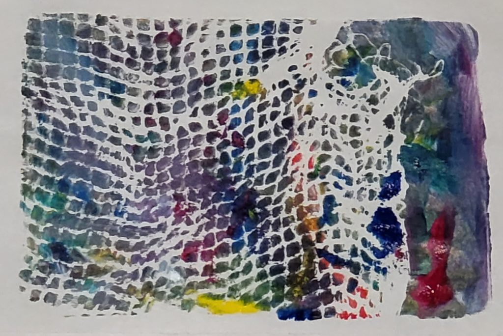
paper on print rectangle art Abstract

This piece’s intention is technique-based – I was following a lesson to use a paintbrush to paint on the plate, then apply a printing technique.

I painted, then put netting between the paint and the paper.

In this way, I intentionally made a print that was different from painting directly on the paper.

What does this have to do with product management? I find that being creative and letting my mind wander helps me understand my thoughts, opens up my mind, and creates new neural pathways. Increasing my ability to understand thoughts and patterns is directly related to leveling up my Product Management skills.

It also feels good, scientifically.

Another PM superpower is listening. One way to develop listening skills is to listen to myself. What does my own inner monologue reveal about the connections I make? What do I do when something isn’t going as planned? Am I deeply invested in the direction I want the art to go in – why or why not? Am I satisfied if my art turns out different than I intended?

My starting limits were the size of the gelatin plate – 5″x7″ (approx 13 x 18cm) – and the paints I used. I was using a new set of paints that had 6 colors: yellow, red, magenta, blue, green and white. I decided to only use newsprint to print on – I have other materials but it had been months since I painted, so I wanted to keep it simple.

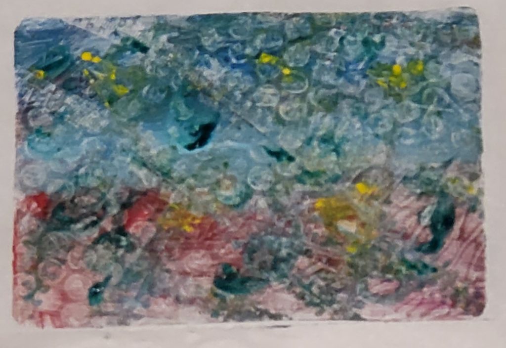
Here’s what I created, and my inner monologue. See how my thoughts translated into the artwork:

blue, red, yellow and green all interplay in this abstract art print

It’s Pride month, I’ll start with bi pride colors, blue on top.

White for the middle of the plate, magenta on the bottom, then I’ll combine them for purple in the middle.

Before I combine, this blue/white/magenta reminds me of the French flag. France . . . cheese! I’ll paint yellow triangles.

I used most of the colors but not green…the moon is made of green cheese…so some circles in green. And swirls.

OK, now do something with it that gives it a reason to be a print. Let’s run this car with textured tires over the plate. And now let’s apply this bubble wrap. OK, now to put the paper on and print it.

My intention – a bi pride flag – completely changed after I painted a little, and my brain made the connection to the French flag. The end result is something I happen to like to look at. Do I look at it and think of a French cheese, like Camembert? No.

This is practice – going through the process of creating one piece of art. It’s practice following the threads to the initial idea, to the final outcome. It builds up discovery skills. It helps see patterns and make connections – helpful when listening to understand customers, stakeholders and employees. It’s also helpful when creating or updating strategies, tactics and other plans.

So much of what we hear, see, and make is shaped by always changing, multi-layered sets of ideas and ideals. Art helps me level up so many skills; among them, the ability to follow a wandering path, make connections, and build understanding.

Getting to No: Tactics and Scripts to Stay Close to Your Path

Whether you’re trying to get alignment on goals, strategy, tactics; or stick with them during quarterly planning, daily standups, and when urgent items come up – you need to be able to recognize which ideas will lead you astray, and be able to resist them, while growing and maintaining good relationships.

This talk, first presented at Building Products That Matter, Together addresses the tough work of being able to execute your plans effectively. Attendees will learn how to figure out what to accept, delay and reject, as well as learn several scripts of how to reject and delay ideas without destroying trust and goodwill with stakeholders and customers.

Here are the slides – you can see them here and use the menu at the top right of the box (3 dots, “hamburger menu”) to download the slides if you prefer:

The video is available on ProductBoard’s website – it requires a login, but it’s completely free.